BRAND IDENTITY
FOR VATER PERCUSSION
PROBLEM
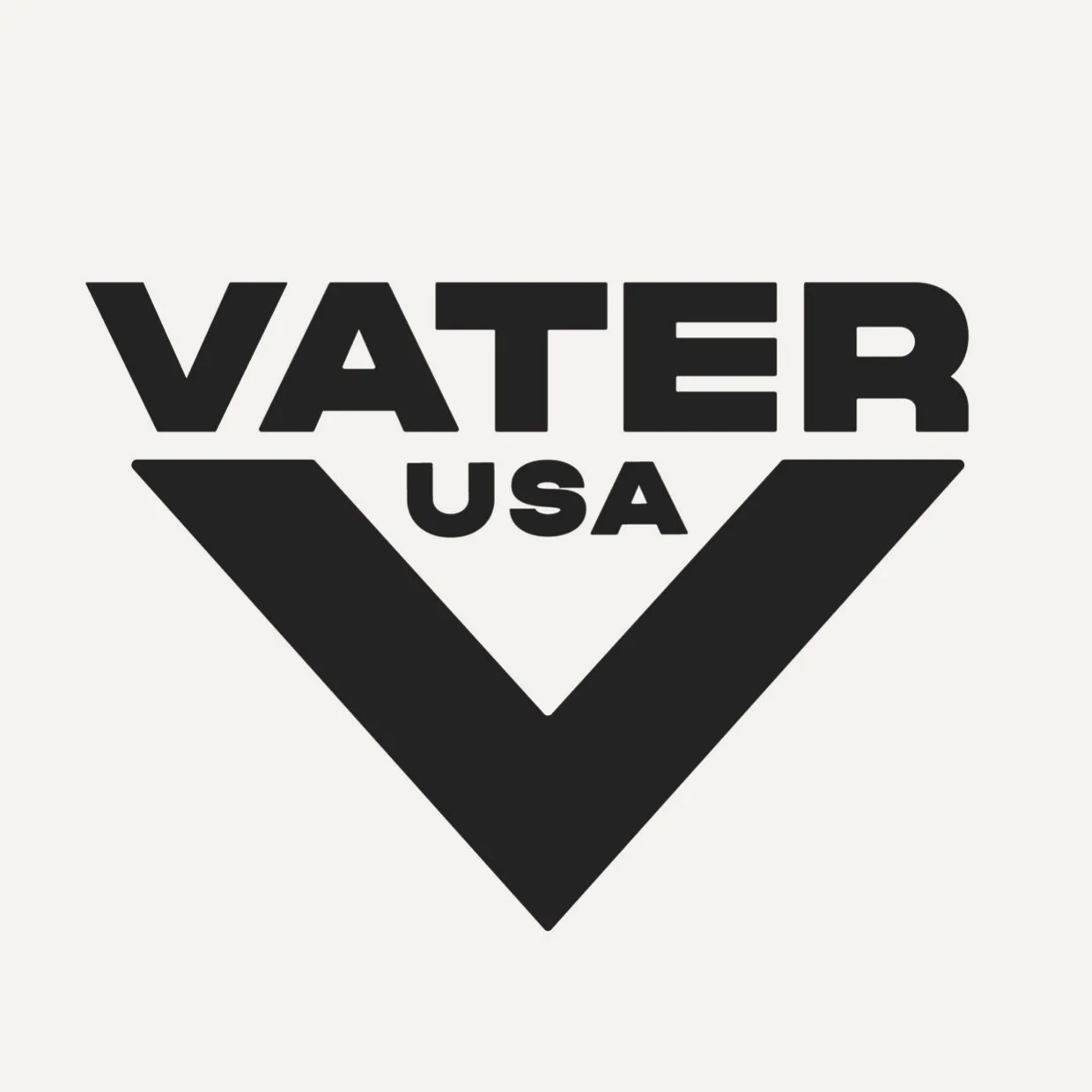
Vater Percussion is a USA-based percussion instrument brand. They are a staple brand in their industry, but their branding felt outdated to me. Particularly, the logo was difficult to read, especially at small sizes.
SOLUTION
The rebrand focused on recreating their logo while maintaining their iconic 'V' signature. I used a different font and composition and dropped the word 'percussion' because I felt the brand had enough history to be recognized by its main name, 'Vater,' alone.
MY ROLE
This was a self initiated passion project that is still ongoing as I continue to expand the brand identity to see what it would look like in print, social, web and more.


